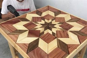
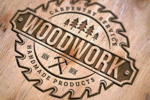
Visual representations designed to symbolize a carpentry enterprise are crucial elements of branding. These designs encompass a variety of graphic approaches intended to communicate the values, skills, and specialization of a woodworking company. Examples include logos featuring stylized trees, tools, finished wood products, or abstract geometric shapes suggestive of craftsmanship.
A distinctive symbol yields numerous advantages. It facilitates brand recognition among potential clientele, fosters a sense of professionalism and trust, and differentiates the company from competitors in the marketplace. Historically, such symbols evolved from simple trade signs to sophisticated designs reflecting evolving aesthetic trends and marketing strategies. The impact of a well-conceived visual identity extends beyond mere aesthetics, influencing consumer perception and ultimately contributing to business success.
The subsequent sections will delve into the key considerations for creating effective visual representations for woodworking businesses, including design principles, color palettes, typography, and specific examples tailored to various niches within the woodworking industry.
Effective Visual Branding Strategies for Carpentry Enterprises
Crafting a compelling visual brand identity requires careful consideration and strategic application of design principles. The following guidelines offer practical advice for developing representations that effectively communicate the essence of a carpentry business.
Tip 1: Prioritize Simplicity and Memorability: Overly complex designs can be difficult to recognize and recall. A simple, clean graphic is more likely to leave a lasting impression. For example, a stylized silhouette of a common woodworking tool is more impactful than a detailed illustration.
Tip 2: Reflect the Business’s Specialization: The design should hint at the company’s area of expertise. A business specializing in fine furniture might opt for an elegant, flowing design, whereas a construction-focused carpentry firm may prefer a bolder, more robust visual.
Tip 3: Choose Colors Wisely: Color psychology plays a significant role in brand perception. Earth tones often evoke feelings of warmth, reliability, and craftsmanship, while bolder colors can convey innovation and energy. The selection must align with the intended brand message.
Tip 4: Select Legible and Appropriate Typography: The font should be easily readable and consistent with the overall visual style. A classic serif font may suit a traditional woodworking business, while a modern sans-serif font might be more appropriate for a contemporary design studio.
Tip 5: Ensure Scalability and Versatility: The chosen symbol should remain effective at various sizes, from business cards to large signage. It is advisable to design the image in vector format to preserve clarity during scaling.
Tip 6: Research Competitor Branding: Analyzing the visual identities of competing businesses can provide valuable insights into market trends and help differentiate a business’s own image.
Tip 7: Test the Image With Target Audiences: Gathering feedback from potential customers can provide valuable insights into the design’s effectiveness and resonance before finalization.
These suggestions provide a foundation for developing potent symbols that effectively reflect a carpentry enterprise’s unique values and capabilities. A well-designed symbol strengthens brand identity, enhances market presence, and ultimately contributes to business success.
The succeeding sections will explore in greater detail the specific stylistic and thematic choices applicable to different carpentry niches and target markets.
1. Tool Silhouettes
The effective utilization of tool silhouettes within visual representations for carpentry firms stems from their immediate and universally understood connection to the trade. The direct link between a tool and the craft itself offers a potent means of conveying the business’s core activity. For instance, a sharply defined outline of a hand plane, a chisel, or a dovetail saw immediately signifies woodworking. This visual shorthand allows the company to communicate its services efficiently and effectively.
The choice of a specific tool silhouette can further refine the message. A vintage hand saw might suggest a focus on traditional methods and craftsmanship, while a router bit silhouette could indicate specialization in custom design and fabrication. Consider, for example, the “Black Bear Woodworking” logo, which employs a silhouetted bear holding a broadaxe. This not only implies their woodworking expertise but also incorporates a distinctive animal symbol for added memorability. Similarly, “Artisan Woodcraft” uses a simple hammer silhouette to suggest the basic construction processes involved.
The simplicity and directness of tool silhouettes contribute significantly to their versatility in different design contexts. They can be easily scaled, adapted to various color schemes, and incorporated into different layouts, from business cards to website headers. The understanding of this connection is crucial for woodworking businesses seeking to establish a strong visual presence, as tool silhouettes provide an immediate and recognizable signifier of their trade and expertise. Choosing a silhouette that reflects a business’s specialization contributes to the overall effectiveness of its branding efforts.
2. Wood Grain Patterns
The integration of wood grain patterns into visual representations for carpentry enterprises introduces an element of authenticity and organic appeal. The natural variations and inherent beauty of wood are universally recognized and can effectively convey the inherent characteristics of the craft.
- Representation of Authenticity and Natural Materials
Wood grain patterns intrinsically signify the utilization of natural materials, an essential element of woodworking. Incorporating these patterns communicates genuineness and a commitment to utilizing raw, unadulterated substances. For instance, a carpentry business specializing in reclaimed wood furniture might prominently feature a weathered wood grain pattern to emphasize its dedication to sustainable practices. The replication of various wood species’ grain patterns allows for nuance, enabling a firm to align its visual identity with the specific types of wood they commonly employ, such as oak, maple, or walnut.
- Conveyance of Craftsmanship and Quality
The intricate details of wood grain suggest a level of care and precision associated with handcrafting. A swirling, complex grain pattern can imply attention to detail and a commitment to high-quality workmanship. An example can be seen in a logo for “Heirloom Furniture,” where an elaborate burl wood pattern enhances the perceived value and sophistication of their products. The texture and visual depth provided by these patterns contribute to the overall impression of skill and expertise.
- Creation of Visual Interest and Texture
Wood grain adds visual interest and depth to otherwise simple designs. The organic lines and variations offer a welcome contrast to static geometric shapes. Imagine a logo with a minimalist font paired with a subtle wood grain background; this combination creates a balanced and appealing image. The use of different wood grain textures can also subtly suggest the type of finish or treatment applied to the wood, further enhancing the logo’s relevance and communicative power.
- Adaptability Across Branding Applications
Wood grain patterns can be effectively integrated into a variety of branding materials, from business cards and website backgrounds to signage and promotional materials. Their versatility allows for a cohesive and consistent brand image across all touchpoints. For example, a woodworking company could use a consistent wood grain pattern across its website, invoices, and business cards to create a unified and recognizable brand identity. The ability to subtly adjust the color and intensity of the grain pattern provides further flexibility in adapting the design to different media.
The strategic use of wood grain patterns within visual symbols offers a nuanced and effective way to communicate a carpentry business’s core values and specializations. Through the careful selection and integration of these patterns, companies can enhance their brand identity, foster trust, and distinguish themselves from competitors within the woodworking sector.
3. Abstract Geometry
The application of abstract geometric forms in visual representations for carpentry businesses provides a modern and sophisticated alternative to more literal depictions. This approach relies on simplified shapes and spatial arrangements to communicate brand identity and values without directly representing tools or wood products.
- Simplification and Clarity
Abstract geometry offers the advantage of distilling complex concepts into easily recognizable forms. A series of intersecting lines may suggest structural integrity, while a nested square can symbolize precision and craftsmanship. “Precision Carpentry,” for instance, may utilize a logo featuring a series of perfectly aligned triangles to communicate accuracy. The reduction of visual clutter ensures the symbol remains memorable and effective across various media.
- Modern Aesthetic and Innovation
The utilization of geometric shapes projects a contemporary and innovative image, appealing to clients who value modern design sensibilities. A business specializing in bespoke, contemporary furniture might adopt a logo featuring a Mobius strip to suggest creativity and unique solutions. This aesthetic sets the firm apart from competitors relying on more traditional imagery.
- Versatility and Scalability
Abstract geometric symbols tend to be highly versatile and scalable, rendering them suitable for a wide range of applications. A well-designed geometric logo can maintain its visual impact whether displayed on a business card or a large-scale sign. The clean lines and simplified forms facilitate easy adaptation to different color palettes and branding materials. The ‘Form & Function Woodworks’ logo using tessellating hexagons offers an example of repeatable patterns that are aesthetically pleasing and easily scalable.
- Symbolic Representation of Core Values
Geometric shapes can be imbued with symbolic meaning, allowing a woodworking business to communicate its core values and principles. A circle might represent unity and wholeness, reflecting a commitment to collaboration and customer satisfaction. A square, as mentioned earlier, could suggest stability and reliability. A business emphasizing sustainable practices could combine geometric forms with organic curves to represent the harmony between technology and nature. ‘Evergreen Carpentry’ using circles with leaf-like geometric features can be an example.
The employment of abstract geometric elements in visual branding strategies offers a compelling means of conveying essential attributes. These shapes can powerfully project a business’s values, style, and innovative approach to the craft. It is critical to remember that shapes, although simple, evoke emotions and associations with which potential clients may identify.
4. Custom Lettering
The integration of custom lettering within visual symbols designed for carpentry enterprises offers a distinct opportunity to establish a unique brand identity. Beyond standard typography, custom lettering provides a bespoke solution tailored to reflect the specific character and values of the business.
- Reinforcement of Brand Uniqueness
Custom lettering ensures that the carpentry business possesses a visual identifier that is not readily replicated. A font specifically designed or significantly modified for the brand immediately differentiates it from competitors utilizing off-the-shelf typefaces. A hypothetical “Oak & Ironworks” could commission a stylized font with subtle serifs resembling wood shavings to underscore its craftsmanship. This deliberate visual distinctiveness contributes to enhanced brand recall and recognition.
- Communication of Brand Personality
The stylistic characteristics of custom lettering can effectively convey the intended brand personality. A bold, hand-drawn script may suggest a rustic and artisanal approach, while a clean, geometric sans-serif typeface could project a modern and technically precise image. For example, “Timberline Design” might opt for a rugged, slightly distressed font to communicate durability and connection to nature. The selected style of lettering must align with the overall brand message and target audience.
- Enhancement of Visual Hierarchy and Legibility
Custom lettering allows for precise control over letter spacing, kerning, and other typographic details, contributing to improved legibility and visual hierarchy. A carefully crafted font can ensure that the business name is easily readable at various sizes, from business cards to website headers. Alterations such as increasing the x-height or adjusting the stroke weight can enhance readability, particularly in visually busy environments. “Fine Grain Carpentry” might use custom spacing to ensure each letter is distinct and easily recognizable.
- Integration with Visual Elements
Custom lettering can be designed to seamlessly integrate with other visual elements within the logo, such as icons or illustrations. Letters can be shaped to resemble woodworking tools or incorporate wood grain patterns, creating a cohesive and visually appealing design. ‘Artisan Woodcrafts” can have their “A” shaped as a hand plane, creating a clever visual pun that unifies the lettering with the brand’s core product. This integration strengthens the overall brand identity and creates a more memorable visual impression.
The deliberate employment of custom lettering provides a strategic advantage in the creation of logos. It ensures that the visual representation of carpentry firms is both distinctive and reflective of their unique character, which in turn leads to greater brand recognition and consumer engagement. The key is the seamless cohesion of custom lettering and other aspects of the visual identity.
5. Color Palettes
The strategic selection and application of color palettes are fundamental in crafting effective visual symbols. Color directly influences perception and emotion, making it a critical factor in communicating the desired message and attracting the target audience.
- Evoking Natural Materials and Craftsmanship
Earthy tones, such as browns, tans, and muted greens, often represent wood and natural resources. A carpentry business utilizing these colors communicates an affinity for traditional craftsmanship and the inherent beauty of the materials. Examples include “Timberline Furniture,” which might employ a palette dominated by warm browns and forest greens, or “Rustic Creations,” using a range of tans and beiges to suggest weathered wood. The selection should reflect the specific types of wood and finishes the business commonly uses.
- Conveying Modernity and Innovation
Cooler palettes, encompassing blues, grays, and even metallic accents, can project a sense of modernity, precision, and technical expertise. A carpentry business specializing in contemporary designs and utilizing advanced techniques might opt for a color palette centered around these hues. For instance, “Precision Millwork” could incorporate a combination of grays and blues to suggest accuracy and technological sophistication. These palettes convey a focus on innovation and cutting-edge techniques.
- Creating Contrast and Visual Hierarchy
The strategic use of contrasting colors enhances visual interest and improves the overall legibility of the logo. Pairing dark and light colors ensures that the design elements stand out and are easily distinguishable. A logo with a dark brown background, for example, might utilize a lighter beige or cream for the lettering. This contrast creates a visual hierarchy, guiding the viewer’s eye to the most important elements of the design.
- Reflecting Brand Personality and Values
Color choices should align with the overall brand personality and values of the carpentry business. A business emphasizing sustainability and environmental responsibility might incorporate greens and blues to evoke a sense of nature and eco-consciousness. A business focused on luxury and high-end craftsmanship could utilize gold or silver accents to convey opulence and sophistication. For example, “Greenleaf Woodworking” might use a blend of greens and browns. The thoughtful selection of colors reinforces the brand’s core message and resonates with the target audience.
In conclusion, the selection and integration of color palettes represents an essential element in visual brand identity for woodworking businesses. These selections are directly tied to a company’s success and image. The color palette, therefore, must be carefully evaluated to ensure it effectively communicates the intended message.
Frequently Asked Questions About Visual Representations for Carpentry Businesses
The following addresses common inquiries concerning the conceptualization, design, and implementation of visual symbols intended to represent woodworking enterprises.
Question 1: What are the essential elements of a woodworking business’s visual representation?
The crucial constituents often include a memorable graphic symbol, a carefully selected color palette, and a legible, appropriate typeface. These elements should collectively communicate the business’s values, specialization, and target audience.
Question 2: How important is simplicity in the creation of a symbol?
Simplicity is paramount. Overly complex designs tend to be difficult to recall and recognize. A clean, uncluttered visual is far more likely to leave a lasting impression on potential customers.
Question 3: Should a company’s specialization be reflected in its symbol?
Yes, the visual should offer insight into the business’s area of expertise. A firm specializing in antique restoration would benefit from a design aesthetic different from that of a company focused on modern cabinet construction.
Question 4: What role does color play in the effectiveness of a symbol?
Color significantly influences perception and emotion. Earth tones are often associated with craftsmanship and reliability, while bolder colors can convey innovation and energy. The selection must align with the intended brand message.
Question 5: What are the key considerations regarding typography?
The typeface must be easily readable and consistent with the overall design aesthetic. A classic serif font might suit a traditional woodworking business, whereas a modern sans-serif font might be more appropriate for a contemporary design studio.
Question 6: How can a business ensure that its visual representation is versatile and scalable?
The design should remain effective at various sizes, from business cards to large signage. Designing the graphic in vector format preserves clarity during scaling. It is advisable to test the design across different mediums to ensure optimal visibility and impact.
Careful consideration of these frequently asked questions serves as a foundation for the creation of effective visual symbols that accurately reflect the values and capabilities of a woodworking business.
The subsequent section will address emerging trends in visual branding within the woodworking industry.
Visual Identity in the Woodworking Sector
The preceding analysis has underscored the significance of visual branding for businesses engaged in carpentry. Key aspects such as tool silhouettes, wood grain patterns, geometric abstraction, customized lettering, and strategic color palettes each contribute to creating memorable and effective visual symbols. The careful application of these design elements differentiates woodworking enterprises in a competitive market, influencing consumer perception and fostering brand recognition.
The development of effective symbols designed for carpentry businesses is a crucial component of overall market strategy. Continued investment in refined visual identity will likely correlate with enhanced brand equity and improved client acquisition. The pursuit of visual excellence is, therefore, a strategic imperative for woodworking enterprises seeking sustained growth and prominence.


